
Enrollment generally changes very slowly from one year to the next, but a longer look can provide a lot of surprises. What those are is up to you to find.
This visualization is mostly a report or a summary of what is, not an explanation or even a stab at the why questions I find so interesting. The data go back to 1990, showing even-years only, and ending in 2018 with the most recent IPEDS data now available. (Note: Institutions that have closed and are not listed in the 2018 Institutions File in IPEDS are not included.)
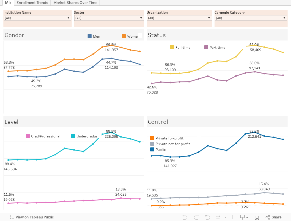
There are three views:
The first shows changes in Mix over time: What has happened to undergraduate enrollment, for instance, or how has the percentage of women enrolled changed over time? The view starts with the highest level possible, but you can look at a single institution, a sector, a Carnegie category, or even a location type to filter the data.
The second tab (across the top) shows total headcount enrollment in Fall, colored by institution, on the top, and the percentage change since the first year selected (change the included years using the slider at top right.) For clarity's sake, I started with four-year publics, but you can of course change that, and filter even farther by Carnegie type. If you want to see a certain segment of enrollment, you can do that, too, using the student filters on the bottom right. Find your institution by typing any part of its name in the Highlight box.
The final tab shows market shares over time. Again, filter by institutional type at top right; filter by student type at bottom right. The display shows the percentage of the selection enrolled in that institution at that year.
You look at 100 year old trees and you think everything has been the same forever. But enrollment is always changing Out Here in Oregon.
Comments